24 April 2023 | 4 Minute(s) to read
Since 2021 Smokeylemon has been working with Starmart Supermarket, based in Tabubil (Western Province) Papua New Guinea.
In 2022 we went to visit our clients for the first time, on the ground in Tabubil. The purpose of this trip was to scope various projects we had lined up with them while also conducting mini marketing and brand workshops, and capture footage and photography for the Supermarket and their new takeaway restaurant ‘Pizza Haus’. So as you can imagine it was a busy, humid but very rewarding trip.
Coming out the back of this and working in tandem with multiple projects for an overall brand refresh - we also took on the challenge of helping reimagine and redesign the store's interior, with retail-spacial designers ‘Lane Industries’ who are based in Perth.
We were faced with a cart before the horse scenario with this project, as we were working on the brand refresh while putting together ideas and concepts for how the brand would be applied in-store due to production timelines and the physical time it will take to get all building materials and assets to Tabubil.
Not being your ‘typical’ supermarket (Tabubil is literally in the jungle) we wanted to push the new identity while also giving it a bit of local flavour. Strong, bright colours, anchored by warm grey and brown tones which directly relate back to the region of PNG where the client is situated, while also showing off some of the natural beauty of the region. We wanted the customers to feel as though they have a linkage to the store while also providing a dramatic change to enhance their shopping experience.
The project is a staged process to allow the shop to still trade while the renovation takes place, as the supermarket is really the only source of daily food products in the village.
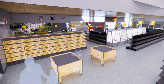
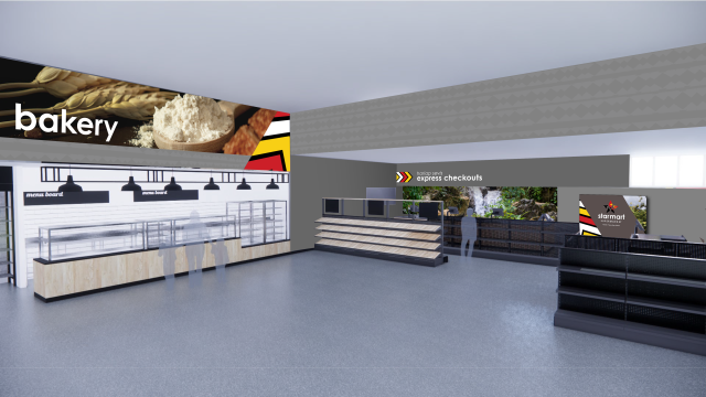
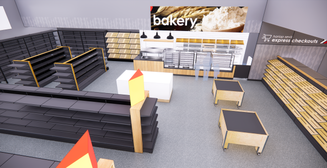
In the first stage we are focusing on the checkouts, front of house wayfinding, the bakery and internal branding opportunities and offering a space to tell the ‘Starmart Story’.
After finalising the colour palette we provided multiple concepts for potential colour and brand applications, working through these concepts with Starmart and Lane Industries. The palette provided natural wayfinding with the secondary more muted palette being utilised to anchor the bright primary palette.
Because there are nearly 850 languages in Papua New Guinea the client’s directive was to utilise imagery, photography and iconography as a primary form of visual communication coupled with English and Tok Pisin (Pidgin English).
As the brand application progressed, so did the design and layout of the store. As a bulkhead over the checkouts was developed we had to understand how the customer viewed wayfinding in different ways around the store, and because the scale of the store is so large how do all the brand elements work together as part of a literal ‘customer journey’.
The brand package we developed included strong visual assets, a chevron of red, yellow and white which organically lends itself to wayfinding for express and standard checkouts while also adding movement and framing capabilities for branding and shop sections.
We also developed a subtle abstract weave pattern that represents the traditional hand woven ‘Bilum’ bag. This graphical device is utilised to break the grey tones up while also adding a visual rhythm and repetition, which helps balance out the strong chevrons and bold imagery.
In some instances you will also see an uneven texture pattern sparingly used on the darker greys to add balance dimension to the heavier colour.
A natural wood coupled with a dark grey powder coated racks are placed thoughtfully throughout the design which seem to work really cohesively with the bold branding and colour palette.
Physical work has already started with the front of house, in preparation for the new floor, walls and bulkhead.
The brand assets, wall prints and iconography is currently in production and we are now looking at wayfinding for the isles at the back of the store.
As the project progresses into something tangible we plan to provide blog updates on the installation through to the completed project.
For now take a look at the 3D renders of the checkouts and bakery!
Jimi - Creative Director