13 January 2020 | 5 Minute(s) to read
When Sunita, one of the board members of Pride Taranaki, approached us about creating their logo, we got super excited. It was our opportunity to develop a logo that would represent the LGBTQ+ community of Taranaki in all their events and communications. What a challenge!
What is pride taranaki you might be asking?
Pride Taranaki is a charitable trust to support the LGBTQ+ community in Taranaki with regular social events and an annual festival to increase visibility and inclusivity in the region.
First, we talked
Before delving into sketching up concepts or even thinking about creating anything on the computer, we sat down with Sunita of Pride Taranaki to find out what they were after.
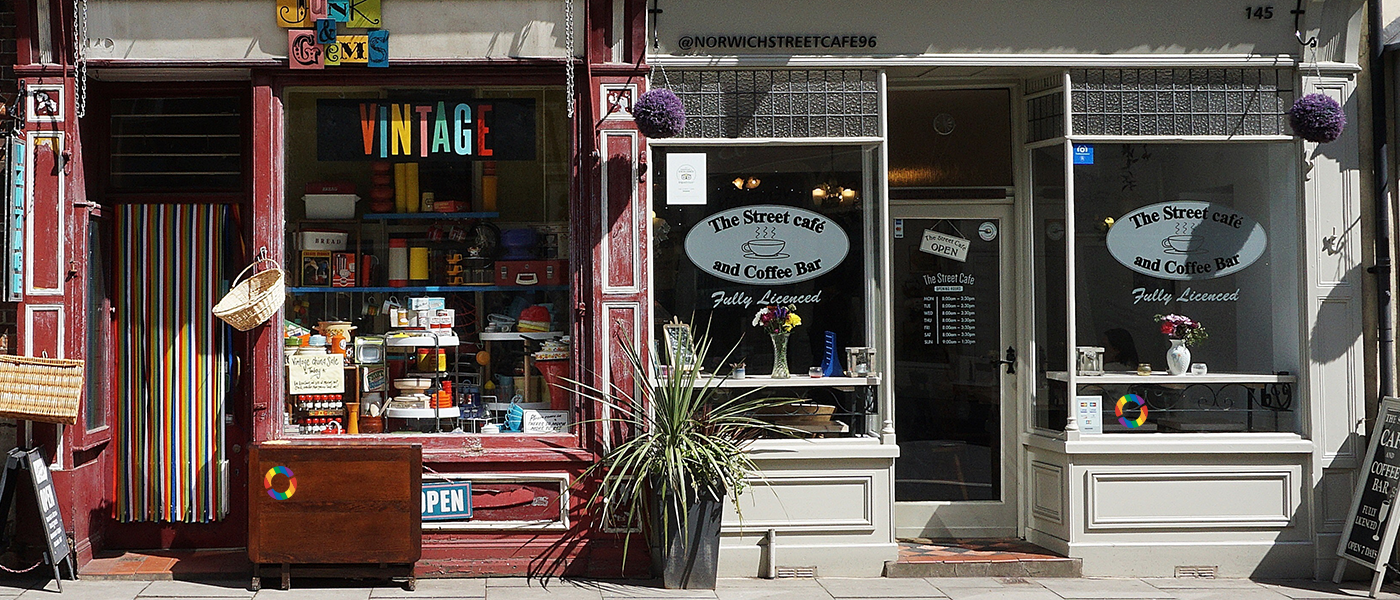
They needed a logo that represented the LGBTQ+ community of Taranaki in posters and throughout social media accounts. When thinking of supporting collateral, we discussed creating a sticker that would be proudly displayed on store windows throughout Taranaki to show that they're supportive and inclusive businesses.
And then talked about colours. For those familiar with the LGBTQ+ flag, a.k.a. the ‘Rainbow Community’ flag, you’ll know that it’s made up of six colours: red, orange, yellow, green, blue and violet. Due to this flag and it’s colours being a main recognisable symbol of the LQBTQ+ community, it was important to have these colours represented in the logo design.
Brief history of the rainbow pride flag
The original Rainbow Pride flag was created by Gilbert Baker (World-famous political activist, designer and flag-maker) of San Francisco. He considered that just like the American flag or the French Revolution flag which owed their beginnings to a riot, a rebellion, or revolution, a gay nation should have a flag too, to proclaim its own idea of power.
The flag had six colours, each with a different meaning: pink was for sex, red for life, orange for healing, yellow for sunlight, green for nature, turquoise for magic, indigo for harmony and violet for spirit. Its design then changed for different reasons over the following years and there are many other iterations around now. But the main six commonly seen and used are the colours that are used in the Pride Taranaki logo design.
Initial research
In the meeting with Sunita we talked of other Pride communities throughout New Zealand and their branding. I had not seen any of this branding so did a bit of research to see how they had been branded. We also discussed the desire to not have a ‘tacky’ or over the top aesthetic that had been seen in some representations of the Pride community worldwide.
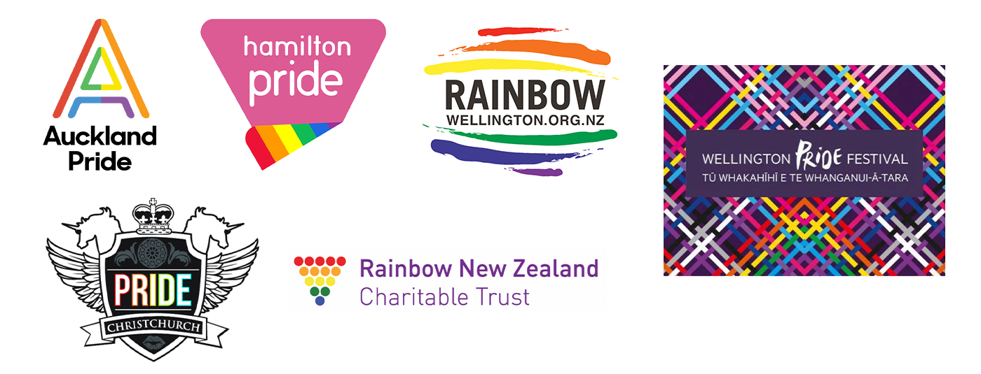
When looking at other ways that branding for Pride communities had been executed, I felt the best approach was to keep the text clean and concise. I didn’t feel the need to add extra elements like unicorns as with the Christchurch logo design. I felt it best to keep emphasis on the word Pride.
Sketches & colour
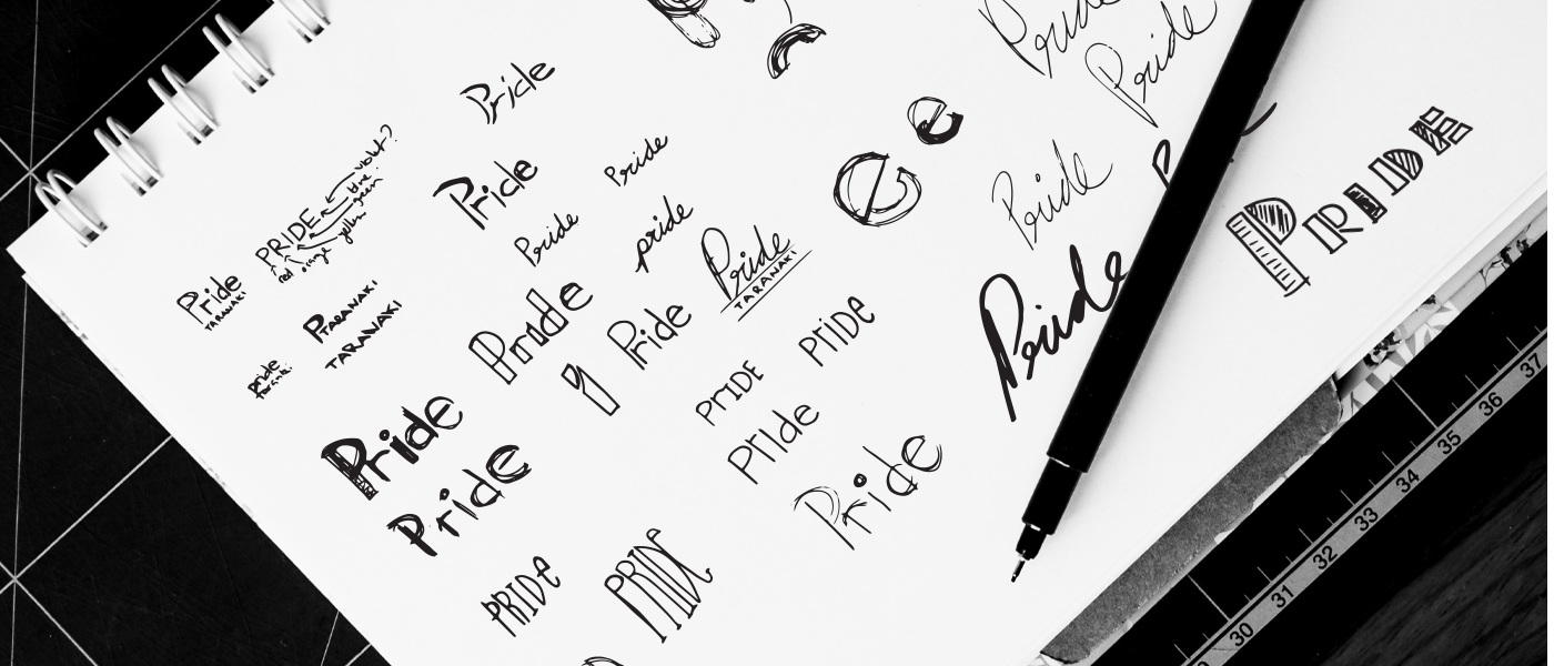
Now that the brief had been defined and the initial research was done, it was time to start sketching. A consideration I took was wanting to create the letters with a minimum amount of straight lines. When sketching I played around with the curves on letters, noticing that the ‘r’ naturally created a classic rainbow shape.
For the application of the colour, it was crucial to learn that it is seen as disrespectful even sacrilegious to change up the order of the flag. Also, the six colours had to be represented evenly on the logo. Being ‘Pride’ a five-letter word, this was the first design challenge. I approached this multiple ways; using horizontal, vertical and diagonal orientations of the colours, this way the colours were mixed over the five letters.
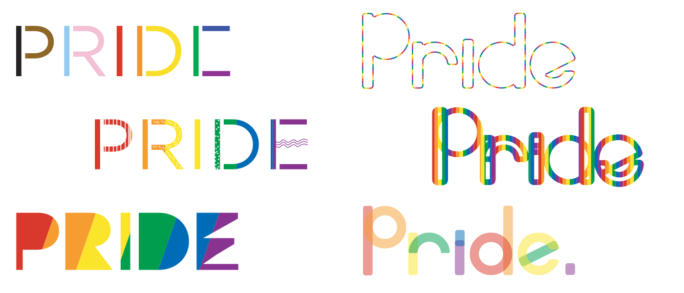
Another way I tried tackling this was creating shapes (circles and rounded rectangles) within each letter allowing more surface area to apply colour to, as seen below.
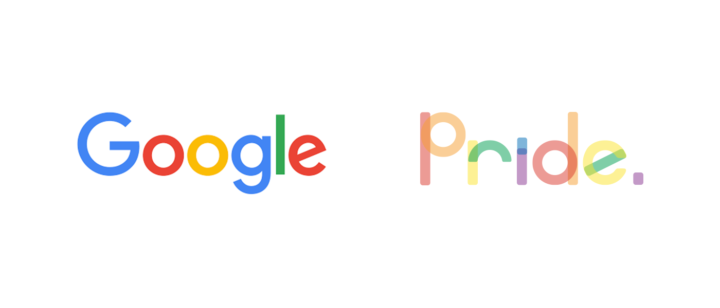
This particular concept started looking too much like ‘Google’. So, I revisited the design and replaced the shapes with just their outlines. This allowed for playful interception throughout the letters. I then overlaid the six colours of the rainbow flag - this allowed for them to spread out evenly.
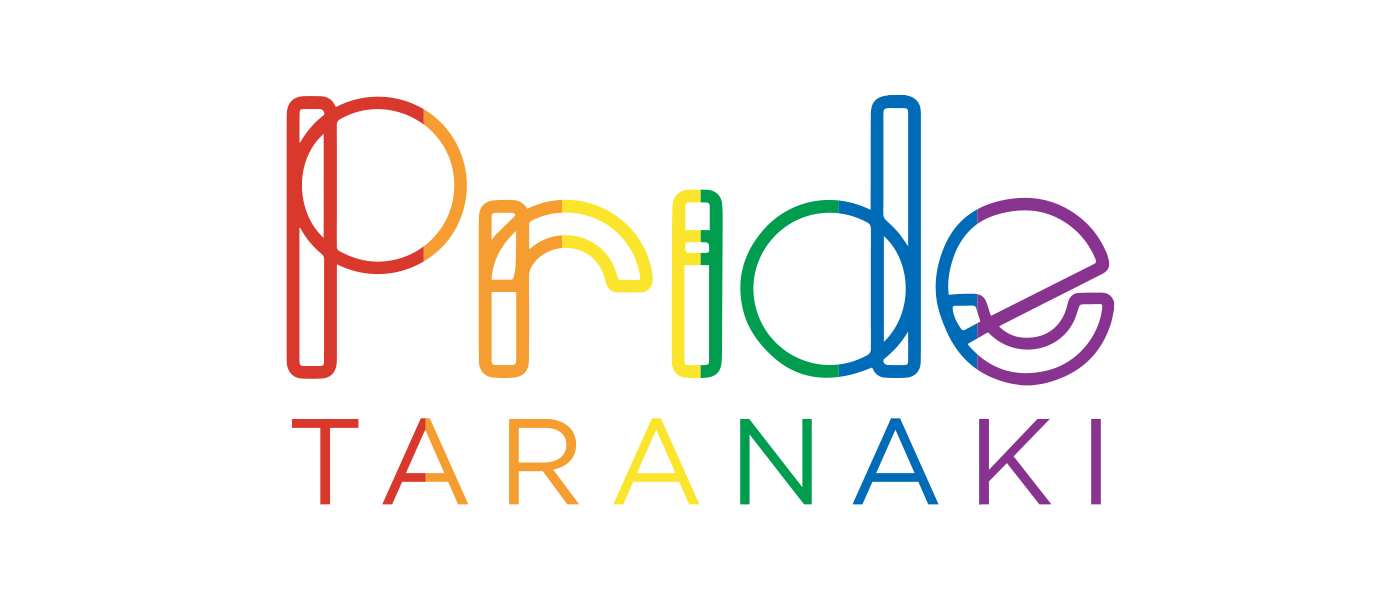
This treatment of the shapes/letters also allowed for the rainbow created in the ‘r’ and ‘e’ to stay visible. These two rainbow shapes are used later on in the sticker idea.
![]()
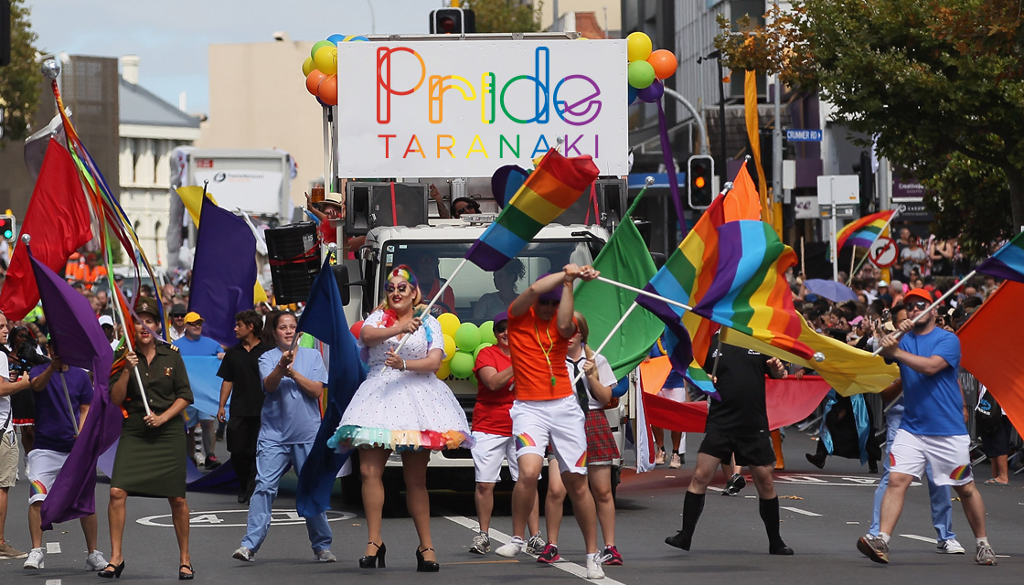
Sunita and the other board members discussed and approved the logo, which now represents the LGBTQ+ community from Taranaki in all their communication channels.
For more information on the now announced Pride Taranaki Festival check out their website or their Facebook page.


