10 October 2018 | 4 Minute(s) to read
Rebranding or updating your logo can be a hard decision but it takes confidence in knowing that your brand can be represented better. Here's a selection of famous brands that took the plunge and allowed their logo to be refreshed to better represent the brand. The key is to not lose the brand’s ethos completely. Which transformations do you find the most surprising?
Below are 10 brands that have rebranded to their now iconic current logos, all in different ways.
Burger King & McDonald’s
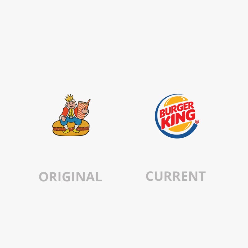
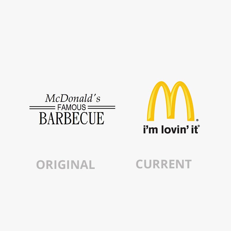
I don’t know about you but I have never seen the original ‘Burger King’ logo and I can see why they have changed it. While Burger King started with a caricature then over time reevaluated their brand's direction - they have still kept the important part - the burger as this lets the viewer know what they do. As well as adding their name in with their logo. By adding imagery and text together they have created an easily identifiable brand mark - a pictorial logotype. While McDonald’s started with a logotype and now, and for many years, have used their ‘golden arches’. The big M that is more than just a letter it’s their brand captured in a mark.
Do you have a type based logo? - it may be worth considering moving towards a logo mark. That can be used alongside your logo’s type or be recognised as a standalone graphic.
Adidas & Amazon
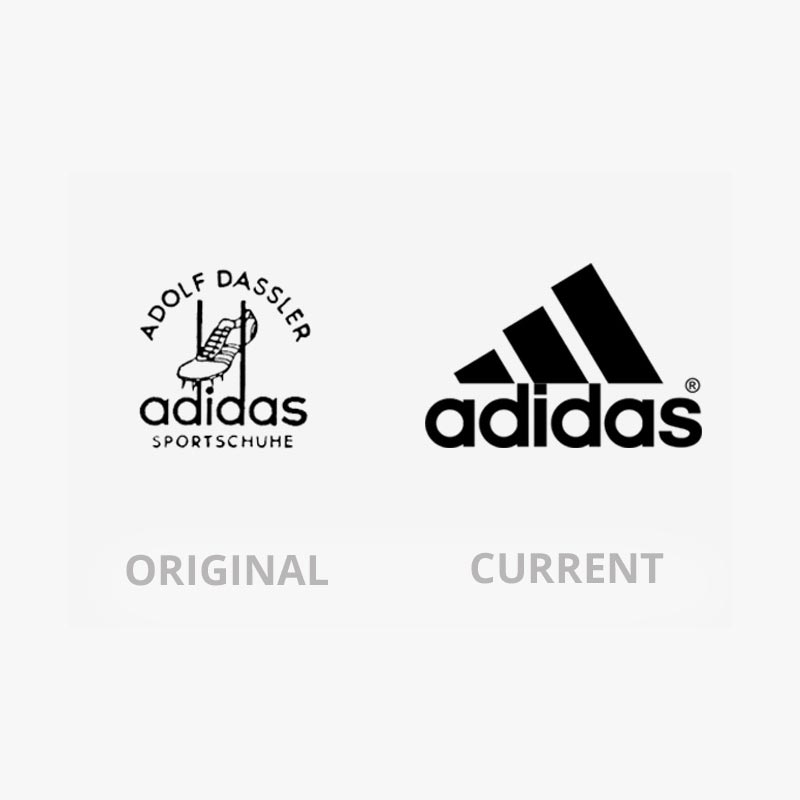
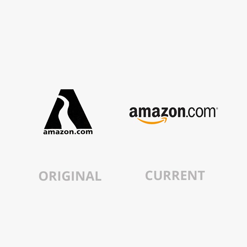
Both these brands started off very pictorially based to explain their brands. Adidas pulled back elements and abstracted to create a clean and recognisable typeface and ‘logo’ - the three stripes, and besides, Adolf hasn’t been a popular name for a good while now. While Amazon clarified what they were trying to say with their first logo, now clearly showing they have a variety “from a to z”. Also with a clean san serif typeface and a smiley face arrow to boot.
Apple & Nokia
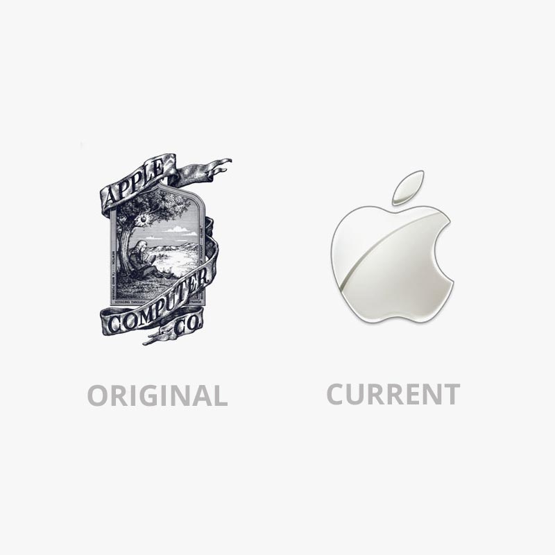
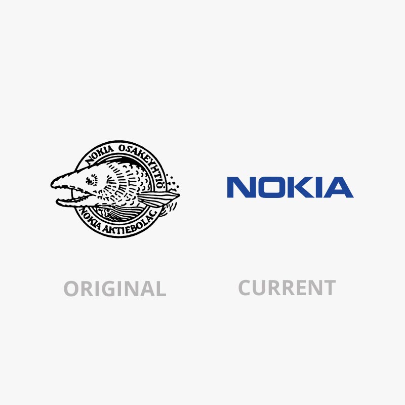
Both brands are in the tech industry and both began with far too detailed logos. They’re a great example of less is more when they moved into what most of us would recognise now.
It’s best to consider how your logo will look at different scales - Is it still legible at 7mm? < As this is the size it would be on social media sites such as Instagram and Facebook - on a mobile. Also it’s worth asking - will it age? Or is your current logo already looking dated?
Disney & Google
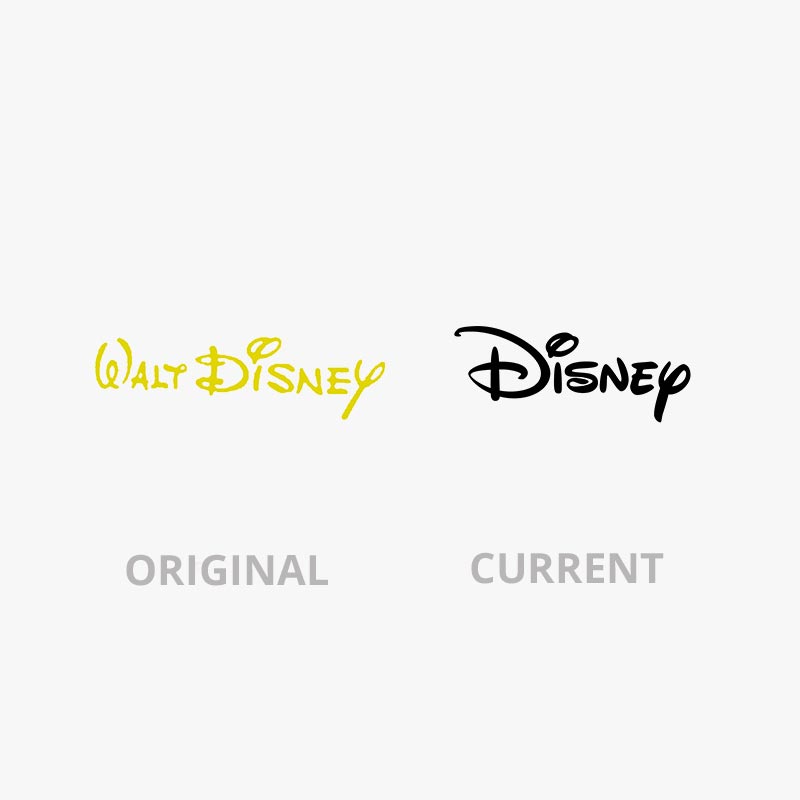
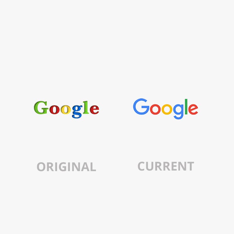
These two brands have not evolved much over the decades they have been in business. But I have included them to show that a logo refresh is worthwhile in keeping your brand looking current/modern. Both Disney and Google have done this without moving away from their brand’s overall feel. Because what's worse than a dated logo? - moving too far away from your brand that customers don’t recognise it. It’s a balance of knowing what to do.
Visa & Starbucks
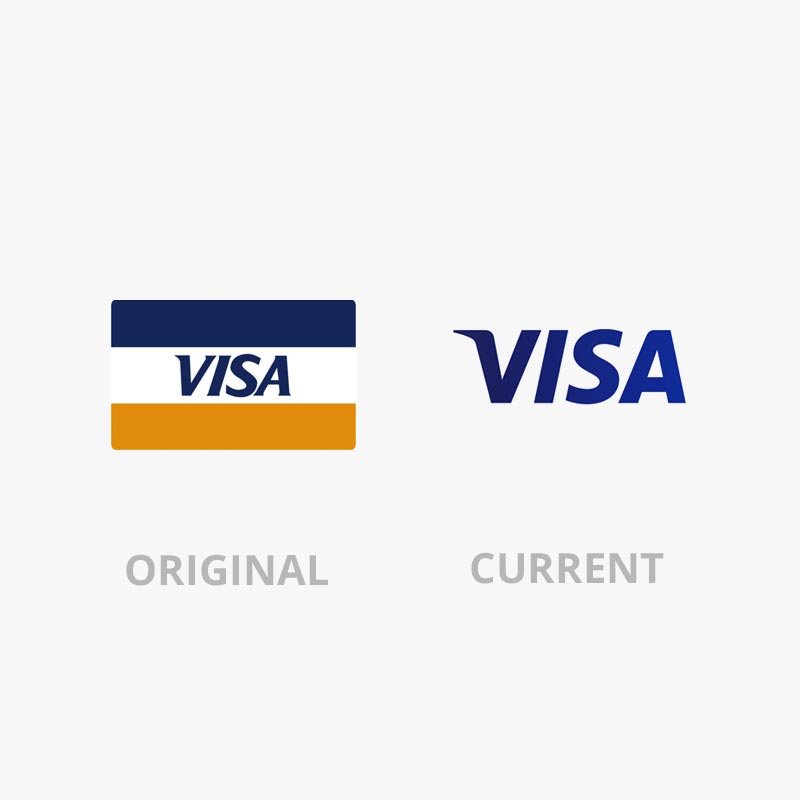
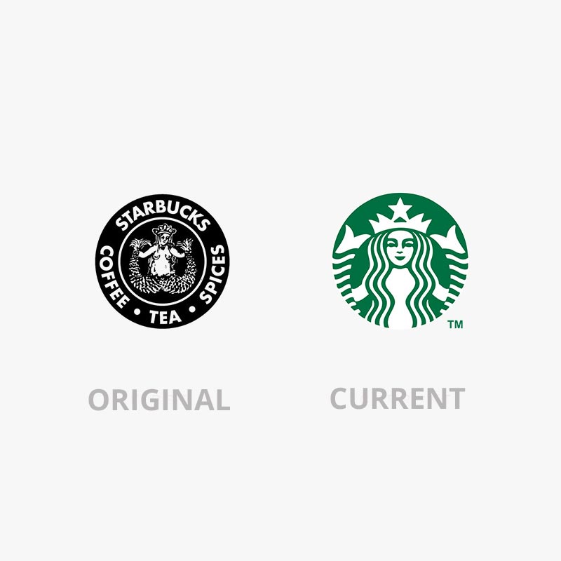
To continue the theme of brands that were updated as opposed to scraping their origins we feel that these two, Visa and Starbucks, have done well. With Visa getting rid of the card like box they didn't lose who they are - mostly due to brand reputation and saturation allowing customers to know who they are. Along with keeping their logotype very similar. While Starbucks cropped theirs and took away the text. Again it is not needed, with having their brand’s colour and a simplified version of their figure.
Overall these logos have all changed for the better, some more drastically than others. It’s all about balance and knowing what changes need to be made and what deserves to be kept. By talking with one of our designers or marketers here at Smokeylemon we’ll be able to sort out the ethos of your brand and help you up your image, along with a modern logo that won’t be scaring new and existing customers away.


